
If you have been working in web design for any time, you have probably heard the term responsive design, or responsive web design (RWD).
Whether you’re a novice or an experienced web expert, creating responsive web designs can be challenging at first, mainly because of the sweeping changes in the way of designing website.
This tutorial will drive you to think in another way to how you design in different ways and what tools you apply to do so. It will challenge you to learn some HTML and CSS if you don’t know them. It will encourage you to learn how some tools used by developers can make their work more quickly and efficiently. You’ll learn to actually enjoy it when you would like to make changes to your design.
What is responsive web design (RWD)?
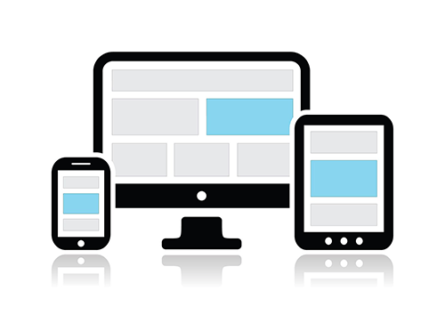
Responsive web design is a technique for creating websites that work on mobile devices, tablets, and desktop screens. It employs several different approaches to make a page change its layout according to the width of the web browser screen. Here is a image of what responsive web design looks like at different width of web screen:
Why is RWD important?
If you consider SEO an important factor making your website stand out of the crowd, here are some reasons why RWD is important to you.
Easy to read
As you may know, it is very difficult to read a four-column web page on a phone that has just 320 pixels screen wide screen. Also, It is just as hard to browse a single column of text that is spread across the 2500 pixels of a large desktop monitor. Responsive web design is developed to fix this problem.
Easy to be indexed
RWD is favored and suggested by most search engines, such as Google. This is because websites that apply RWD have only one URL and the same HTML markup, which makes it easier and more efficient for search engines to index, crawl and manage content. However, some companies create separate, mobile version websites different from its desktop counterpart. This needs different URL and HTML markup, requiring search engines to examine and index more than one models of the same site.
Easy to share
In these days articles, information, graphic and more are easily shared online thanks to the social media platforms like Facebook, Twitter, Google Plus, Linkedin and so on. Therefore, to maximize the benefits of social sharing on websites, responsive web design is vital because it is much more easier for visitors to share, interact with and link to content that lives on a single website and an individual URL than content that lives on a separate mobile version website.
Easy to control
Creating separate, mobile-only websites requires you to have the time, money, and technical knowledge to develop two sites and separate SEO campaigns. Thus, a mobile-only websites is probably out of reach.
However, handling one site and one SEO campaign is far easier than dealing with multiple sites and SEO campaigns. This is a main advantage a responsive website has over a separate mobile site.
You have got some basics about what is RWD and why it is important. Now we move to the next to explore how exactly to create a responsive website by using RWD.
I am assuming that you already have some basic knowledge about CSS3 and HTML.
Some basic concept about CSS3 and HTML can be found in the article Create Your First Web Page With HTML And CSS.
Let’s get started!
Building a fluid layout
A fluid grid by definition is flexible and response to the width of the screen as much as possible.
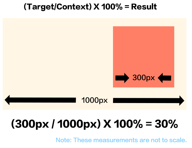
A fluid layout basically means that we are going to turn pixel dimensions into percentage so that they are proportional to their container with one small change. The formula is:
( Target/Context ) x 100% = Result
For example, let’s say you have a design with a width of 1000 pixels, that is the context in our formula. Also, our target element is a sidebar with a width of 300 pixels. Then the width of the sidebar would be 30%, right? This matches our formula, for 300 divided by 1000 equals 0.3, and 0.3 times 100% equals 30%. Here is the math:
Fluid layout plays an important role in creating a responsive design, but it has its limitations. Multiple side-by-side columns look great on a big monitor, like desktop or a tablet in landscape mode, but not so much on a Smartphone. When the width of the screen narrows down too much, the design can start to badly crush. That’s where media queries come in.
Media queries
Another important part of RWD is Media queries, a CSS technology that lets you to assign styles to a page based on the destination browser’s width and height. By using media queries, you can customize your styles for mobile phones, tablets, and desktop browsers so that your design looks great on each type of device.
To achieve this, you have to create breakpoints first.
Creating breakpoints
As mention earlier, media queries allow you to customize styles according to screen widths.
For example, you can ask a browser to change to the mobile style when the screen is no larger than 480 pixels, or the tablet style when the screen is between 481 pixel and 768 pixel or the desktop style when the screen is larger than 768 pixel.
The different width values we specify here- 480, 768, and so on – are normally referred to as breakpoints in responsive design.
Then how to create breakpoints exactly ?
An simple way to figure out this is to take a finished desktop design and open it in a web browser. Seize the browser window’s sizing handle and slowly make the window narrower. At a certain point, the design will probably start to break down. The point at which the design starts to look terrible is a good indication for a breakpoint.
It’s ordinary to create three different breakpoints-one for smartphones, one for tablets, and one for desktops.
There is no limit to the number of breakpoints you can create, that’s completely up to you.
After creating the breakpoints, we have to decide which device we are going to design first, mobile or desktop?
Mobile first or desktop first?
With media queries, it’s unnecessary to create individual sets of styles for each device with different screen width. You can start with a default design without media queries. Then you can use media queries to generate additional styles to override the default styles and re-design the page for the specific screen width.
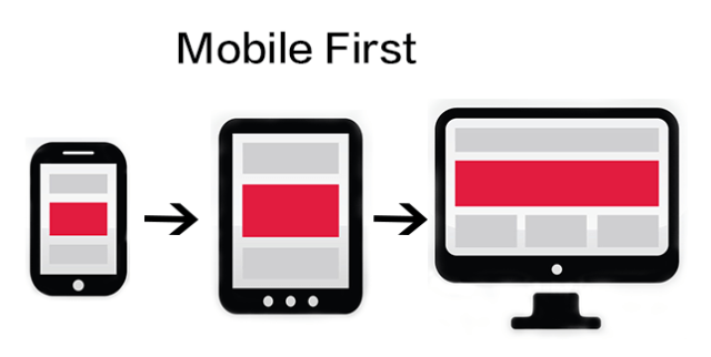
Mobile first
You can design a website with the mobile phone in mind. You create a default design for mobile phone, which is your base design. Then you add media queries for tablets and desktop. These media queries would add more contents and features as the viewport become gradually wider.
Here is the basic style sheet structure for that approach:
/* place styles for mobile and basic styles for all devices here */
body{
/* properties for body here */
}
/* medium display only */
@media (min-width:481px) and (max-width:768px){
body{
/* properties that only apply to tablets */
}
}
/* large display only */
@media (min-width:769px){
body{
/* properties that only apply to desktops */
}
}
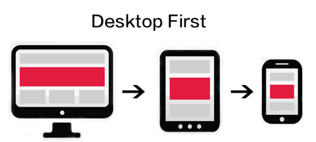
Desktop first
You also can flip that approach on its head by designing first for desktop. You can make your design look great on a large monitor. This becomes your base design. Then you add media queries for smaller devices like smartphones or tablets. In this way, you can refine the design that looks perfect on mobile devices.
Here is the basic style sheet structure for that approach:
/* place styles for desktop and basic styles for all devices here */
body{
/* properties for body here */
}
/* smartphone display only */
@media (max-width:480px) {
body{
/* properties that only apply to smartphones */
}
}
/* tablet display only */
@media (max-width:768px){
body{
/* properties that only apply to tablets */
}
}
How to add media queries inside a Stylesheet?
There are three ways that you can include media queries in a style sheet.
Embed the media query in the style sheet directly
You can include a media query directly inside a style sheet. The code should be something like this:
/* embed the media query in the style sheet */
/* tablet display only */
@media (max-width:768px){
body{
/* properties that only apply to tablets */
}
.style1{
/* class name style1 properties are placed here */
}
.style2{
/* class name style2 properties are placed here */
}
}
Link to different Stylesheet
You also can link a new style sheet for specific screen sizes. In this way, you can manage your code in an easier way if you don’t want to be overwhelmed by a full-fledged website. For example, if you want to include an external style sheet named tablet-device.css containing styles for screens for tablets, which is 768px or smaller. To do that, add the following codes directly to a style sheet:
/* link to a new style sheet using media queries */
Use the @import directive
the @import directive allows you to include additional external style sheets within either an internal or external style sheet. You can also apply @import with a media query. Same example as above, you can add the following code to include an external style sheet named tablet-device.css:
/* use the @import directive */
@import url(css/tablet-device.css) (max-width:768px);
Responsive web design tools
If you follow me through this article, you may be aware of that creating a responsive web design is not that easy, because you are challenged to make a web design that involves flexible grids for layout and CSS media queries to build different styles for different screen width.
Fortunately, the web design community is up to the challenge.
There are a lot of wonderful tools created by web design community out there. I only list three of them from which I personally benefit a lot on my web responsive design journey.
Foundation
Foundation by ZURB is one of the most advanced responsive front end framework in the world, clean and simple. It has two main features: Mobile First Approach and Responsive design. These features allow you to create responsive web design quickly and effectively without redoing the project from scratch.
To use Foundation properly, you should have a basic understanding of the following:
HTML
CSS
Sass
Bootstrap
Bootstrap, created by Twitter team, is another mobile-first framework and claim to be one of the best CSS frameworks for building responsive web designs.
To use Bootstrap correctly, you need to have a basic understanding of the following:
HTML
CSS
Less
Dreamweaver CS6/CC
Adobe Dreamweaver CS6/CC has a new feature called fluid grid layouts. This new feature gives designers a visual way to manage page layout for multiple screen size. You can see the grid structure, modify it, and then place your page regions within the grid.
Conclusion
Responsive Web Design is powerful, because it’s easier to administer just one website for all devices. Most importantly, it is unnecessary to create specific content for mobile devices, while you still keep the benefits of your desktop website SEO on mobile devices.